Kami or Squid for annotating PDFs with stylus on a Chromebook? Mini Review

Recently I got myself a Samsung Chromebook Pro (which comes with a Wacom EMR stylus), and I was looking for apps to annotate PDFs with a stylus. In the end Kami (formerly Notable PDF) and Squid (formerly Papyrus) emerged as top contenders. It’s not entirely a fair comparison, as one is a Chrome extension, the other an Android app, and I used two different PDF files to annotate, but here are my main observations.

Where Kami is better:

  • If you have the Kami Chrome extension enabled as your default PDF reader, you can start annotating as soon as you download a PDF file, as it opens automatically in Kami, with all the annotation tools ready. With Squid it’s a few more steps, as you need to save the PDF first somewhere where Squid can import from (local download folder, Google Drive, Box, or Dropbox), then launch Squid, hit the new note button, choose “Import PDF”, and then navigate to the PDF file to import it.
  • In Kami you can scroll through the entire PDF file during annotating. In Squid, you can only see one page at a time, and you can move forward or back by only one page at a time.
  • As long as you are online, Kami syncs every change instantly to Google Drive, so you have a backup copy, should anything happen to the local device, and can have multiple copies open and synced live on multiple devices (and possibly multiple users, if you’re sharing your PDF file with others). In Squid, there is no sync. Instead, there is a “Cloud backup” option, which only works with Box and Dropbox, and there is only an option to back up every 6 hours or manually. There is also an “Export PDFs” option, which can similarly be set to “every 6 hours” or be triggered manually. In my experience, the Squid backup was not very reliable. Sometimes it failed to upload the backups (blaming it on “network errors,” “I/O errors” and so on), sometimes it only uploaded some of the files, and Box for some mysterious reason failed to sync the files with its Windows client on my laptop. For Chromebook users there are obvious benefits with Kami being so seamlessly integrated into the Chrome browser and Google Drive, and not having to pay for Box or Dropbox. But the instant sync notification in Kami can be a bit distracting during reading and annotating.
  • In Kami you can choose not to use your fingers at all and use the stylus for scrolling and all other actions, if you don’t want to be touching the screen.
  • Kami maintains zoom level as you scroll through the document, while in Squid you need to reset the zoom level each time you navigate to the next page or back.
  • Using Kami to annotate PDFs leaves Squid free for taking additional handwritten notes, and it is easy to switch between Kami and Squid via the shelf. If you’re annotating a PDF in Squid, it is more awkward to switch to another Squid note, as you need to exit each in order to be able to navigate to the other.
  • Kami’s tools (which are in a vertical bar on the left of the screen) are a bit more easily accessible (especially for a left-handed person), and it’s easier to switch between e.g. the pen tool and the highlighter, than in Squid, where the tools are in the top right corner (which right-handed people might still find easier).
  • In Kami it’s possible to scroll the page with a single finger, while in Squid you need to use two, otherwise you end up erasing your annotations. Unfortunately, this can still happen if your two fingers are not entirely in sync, and you accidentally erase stuff in Squid while trying to scroll up or down the page.

Where Kami could improve:

  • While Kami does work offline, the “undo” button is obscured by the offline notification tooltip, so “undo” cannot be accessed in offline mode.
  • When switching between tools, the tooltip labels for the tools (e.g. “Drawing”) persist, intruding into the margin that could be used for annotations, so you need to scroll up or down to be able to annotate on that spot. I don’t see any value in these tooltips persisting (and any need for them at all).
  • Normally when you start annotating a newly opened PDF in Kami, there is a popup asking you if you want to save it to Google Drive for syncing. This is a nice feature when you’re online, but if you happen to get it when you’re offline, the popup persists and is impossible to close, obscuring a part of the PDF, which is pointless and annoying. Even when the internet connection was re-established, I could only get rid of it by refreshing the whole page and reloading the PDF. It looks like a bug.

Where Squid is better:

  • There is no distracting sync notification (but there is no sync either).
  • The exported PDF is properly flattened, meaning that when you open it in another PDF viewer on another operating system, the annotations are fixed, and you can freely copy and paste text from the PDF, without interfering with the annotations, or the annotations interfering with the copying. Kami’s exported PDF on the other hand does not properly flatten the annotations, meaning that they remain floating objects, so if you e.g. want to copy some text from the PDF, you can accidentally start dragging the annotations out of place. Personally I can put up with this (and just use the clean version of the PDF file for any copying), but it could be a problem if someone else might need to read your annotations, and they might unwittingly drag them out of place. Also, Squid’s PDF export was PDF/A-1b standard compliant. But I don’t know if that had something to do with the underlying PDF file and not Squid.
  • Squid (at least on my Samsung CBP) had pressure sensitivity, which meant that annotations could be done in thinner handwriting than in Kami. In general Squid allows for more granularity in stroke thickness etc.
  • While I used different files to annotate for this review, so this information is not directly comparable, it seemed that Squid’s annotations required less overhead in terms of increase to the file size. After annotation, the PDF in Squid increased from 376KB to 791KB in size, while in Kami it increased from 364KB to 6.31MB. For this to be a fair comparison I should have made the exact same annotations to two copies of the same file, but on the whole it suggests that Squid is more economical with its use of data.

Verdict

For now I will probably stick with Kami, as I like the live Google Drive sync, I like the fact that I can scroll through the entire document, and that I don’t risk deleting annotations if I use my finger to scroll up or down. I also like the option of being able to use Kami and Squid together, annotating in the former, and taking additional handwritten notes in the latter. These benefits for me outweigh the negative points about the floating annotations and the big increase in file size.

Update (27 May 2018):

I have also posted this review on the Chrome OS Reddit site, and there was a bit of a discussion.

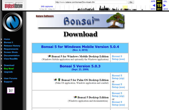
Natara Bonsai downloadable from the Internet Archive

I still get visitors coming to this site looking for the outliner Natara Bonsai almost daily, as I mentioned it occasionally that it was one of my alltime favourite pieces of software. Unfortunately the Natara Bonsai download page went down sometime in 2014, never to come back again. There is now only a placeholder page for the main Natara site that points to the Natara blog (the last post on which dates 6 June 2013).

A few months after the Bonsai site has disappeared, I stumbled upon some kind of a mirror site at http://64.226.29.51/Bonsai/Download.cfm where it was still possible to download the software from. I was very happy to share that link, and I got a few emails from Bonsai fans thanking me for it. Apparently Bryan Nystrom, the owner of Natara Software, Inc., was kind enough to sell them a licence.

Alas, a few months ago this mirror site has also gone down. It seemed that Natara Bonsai was well and truly gone. I was kicking myself for not having taken some screenshots of that site at least, just as a keepsake (yes, that is how much I love this software). Then one day it occurred to me: what if there are some archival pages of the Natara site on the Internet Archive? And lo and behold, there indeed are a number of such pages. And not only that: the Bonsai files can still be downloaded from there! Here is one such link for instance: http://web.archive.org/web/20110519183308/http://www.natara.com/bonsai/Download.cfm

I cannot vouch for the safety of these files, so download and run them at your own risk. But chances are they might just be the original Natara Bonsai files. So fellow Bonsai fans, rejoice!

Natara_Bonsai_Internet_Archive_2011_05_19

PhraseExpander Pro (v. 4.3.0.1) can now detect typing position in browsers

Since October 2013 I have been using PhraseExpander Pro v. 3, and then  v. 4, on a daily basis. (I have discussed the reasons for switching to PhraseExpander before here, and I also mentioned some crucial improvements to its algorithm here.) PhraseExpander has become an essential part of my writing setup, and not only because it is triggered by every single keystroke I type (though that is an important part of it). I use its SmartComplete feature not only to reduce the amount of repetitive typing, but also to help me remember long strings of coding (e.g. the HMTL code for inserting images or highlighting text in Gingko) and the aliases for anonymised people and organisations in my research.

In this post I just wanted to point out an improvement that was released in today’s version of PhraseExpander and which greatly improves the way it works in browsers. In previous versions the SmartComplete box would need to be manually positioned, and it would be stuck in the same position, regardless which part of the browser you were writing in. But in v. 4.3.0.1 now the SmartComplete box pops up right by the cursor, which makes it a great deal easier to use in a browser. This will be extremely useful when writing in an online service such as Gingko app, where different cards reside in different parts of the browser. Below is a screenshot of PhraseExpander’s SmartComplete box displayed by the cursor in Gingko in Firefox. I also tried it in Chrome, and it works the same. See the rest of the latest changes to PhraseExpander here. PhraseExpander with Gingko in FirefoxP.S. In the meantime I have discovered a number of other important benefits to the new handling of browsers in PhraseExpander. Now the SmartComplete box is displayed correctly in Chrome apps as well (i.e. standalone Chrome applications that can run offline), such as the one for WorkFlowy, which I use daily. Also, it can now be used more easily with Google Sheets and Google Docs, and to write emails in browser-based email services.

Most recent process flow for academic writing

Just for the record, I thought I’d repost my comment here that I’ve just left on Christian Tietze’s blog concerning on how I go about outlining and writing on the back of Zettelkasten notes these days.

My latest process flow on Windows 7 for academic writing, using 3 monitors, so some of this software could be viewed simultaneously:

1) read the literature (usually PDF articles or books);

2) take reading notes (mainly quotes + interpretation) in ConnectedText as Zettelkasten;

3) use VUE to develop a concept map to make sense of the material, while reviewing the CT notes in floating windows (i.e. multiple notes can be viewed simultaneously);

4) develop an outline for the paper in a Freeplane mind map, building on the VUE concept map and adding hyperlinks to selected quotes and notes in ConnectedText, so they can be easily called up when writing about a given point;

5) write in plain text using Markdown in WriteMonkey (distraction-free writing software), while checking off nodes in the Freeplane outline as they get written up, and paste in raw EndNote code for academic references, where necessary;

6) paste draft into Outline 4D (single-pane outliner with inline notes) and reverse outline it, i.e. add a heading to each paragraph to see the overall logical structure and content of the paper, and edit it accordingly to improve coherence, eliminate redundancy etc.

7) Import into MS Word, do final editing, add final headings, table of contents, and convert raw EndNote code into formatted references and bibliography.

My minimalist writing environment

…with research question permanently displayed

As I’m writing up my PhD dissertation, I am continuously striving to streamline my writing process and simplify my writing environment. For this reason I have been drawn to minimalist writing applications that reduce unnecessary distractions, such as too much chrome and colourful menu buttons in applications. I use different software for different writing situations. Currently I am writing up a chapter for which I have detailed notes organised in an elaborate Freeplane mind map, which I keep in my right hand monitor.

My central monitor is where I do the actual writing. Currently, this consists of a WriteMonkey window that takes up most of the left and centre of the monitor area, while on the right I have a Notepad2-mod window open to take some ad hoc notes and organise them into a quick outline prior to writing. To do the actual writing, I use Dragon NaturallySpeaking to dictate directly into WriteMonkey, while looking at my Freeplane mind map, which I check off gradually, as described in this post.

Notepad2-mod is a recent discovery for me. It is a replacement for Windows’ own Notepad. I have learnt about it at the Donation Coder forum, where you can find instructions on how to turn it into a very simple plain-text-based outliner. I like to use it in conjunction with WriteMonkey, as it is easy to copy and paste unformatted text from one to the other, and I also find it distraction-free enough. I also use Notepad2-mod as a scratch pad area, to work out ideas quickly, before dictating them into WriteMonkey.

There’s one more screen element that has become an important part of my setup. As I was writing my chapters, I continually wished that I was able to view my main research question at the top of my screen, so that I would be reminded of it at all times, in order not to lose my main focus. However, I had a hard time finding a solution that would display a single line permanently at the top of my screen, without there being any chrome around it, and without it being obscured by maximised windows.

Eventually it was another of Mouser’s brilliant little solutions that allowed me to do this. It is a very simple little application called DesktopCoral, which lets you reserve an area of your screen and prevent other software from covering it. Besides other uses, you can also select a .jpg image file to be displayed within it. So all I had to do was to take a screenshot (using Mouser’s excellent Screenshot Captor) of my research question displayed in a single line in WriteMonkey, and insert it into DesktopCoral’s docking bar, which I docked to the top of my screen. It takes up just a tiny sliver of it. As you can see (exactly because you cannot actually see it!) from the screenshot below, the DesktopCoral bar blends into my screen environment seamlessly.

WriteMonkey, Notepad2-mod, DesktopCoral, Winsplit RevolutionTo achieve this effect, I also needed to enlist Winsplit Revolution, which I used to position the WriteMonkey window into the centre-left area while in full-screen mode (otherwise WriteMonkey would cover up the DesktopCoral bar, as full-screen mode is different from maximised-window mode). (By the way, I’m not bothered by my Windows taskbar at the bottom of the screen. It allows me to quickly switch between applications with the mouse, and I don’t find it too distracting.)

If I did not need the Notepad2-mod window, then I could just centre WriteMonkey in full-screen mode (again, with Winsplit, in order not to obscure the DesktopCoral bar), and the research question area at the top would simply look like it belongs to WriteMonkey itself, except that it is permanently there, and it does not disappear when I scroll up or down, or indeed do anything else: it remains visible even when I close WriteMonkey and switch to other tasks.

At the moment nothing is more important to me than remaining mindful of my research question, therefore I do not mind at all that it is always in my face. I could imagine that other people might find this solution useful for pinning important reminders—or even inspirational quotes—to the top of their desktops to permanently remind them what is important.

The most amazing thing is that, with the exception of Dragon, all of the above tools are free– though their developers do welcome donations, and they deserve them, too. I just love these tools to bits—or should I say, to bytes?

P.S.

If this is just not minimalist enough for you, you could always 1) turn off the numbering in Notepad2-mod, if it’s too distracting, or 2) instead of Notepad2-mod just use another instance of WriteMonkey and position it on the right with Winsplit Revolution, and 3) make the Windows taskbar autohide. With 2) and 3) it would be truly just a single-coloured background with a single-coloured font, and nothing else to distract you. Here is what the screen would look like then (the file name, word count, and time info in blue at the bottom is optional, as is Winsplit’s little floating tool in the bottom right corner):

WriteMonkey with DesktopCoral and Winsplit RevolutionP.P.S.

WriteMonkey’s developer tells me that it is also possible to display the research question with WM’s own Corkboards plugin. And it turns out you may not even need full-screen view + Winsplit to get rid of WM’s Windows chrome: you can just CTRL+right-click with the mouse on the right side of WM’s window, and the chrome disappears. Here is his screenshot of the Corkboards feature:

WriteMonkey with Corkboard plugin

Dragon NS 12.5 and WriteMonkey

I have recently updated my Dragon NaturallySpeaking to the latest version of 12.5. Currently I am using it mainly with WriteMonkey, as I like to write in a minimalist environment. But while I was playing around with Dragon today, I realised that it is also possible to dictate directly into ConnectedText (or any other software not directly supported by Dragon), if you permanently turn off the Dragon Dictation Box feature that pops up. This might mean that not all of Dragon’s features will work in those unsupported software, but I only ever use dictation anyway.

I’m impressed how well Dragon dictation works with WriteMonkey. I wonder what it is about WM that makes it not to trigger the Dragon Dictation Box, as opposed to most of my other non-mainstream writing software…

PhraseExpander’s new algorithm

I’ve been using the text expansion software PhraseExpander Pro for about three weeks now on a continual basis, as I carry on writing up my PhD thesis. I’m also testing it to fulfil my promise to write a review of it at the end. So far it’s been working very well, as I enjoy its speed, its universal functioning across all of my writing applications, the ease of importing my existing word lists from my previous text expansion application, and the ease of adding new phrases. As I’m not a touch-typist, a text expansion tool for me is a must.

I only had one minor gripe with it so far. I’ve got used to using text expansion software in a somewhat unorthodox way. As I don’t want the cognitive burden of having to remember hundreds of shortcuts, I prefer to set up my phrase lists in such a way that I can just start typing the first few letters of a word, and a list of matching phrases in the drop-down box (that appears by the cursor as I type) gets whittled down, with the intended phrase gradually rising to the top of the list as the match becomes more complete.

Here is an example. Let’s say I want to type the word “conceptual.” I would just type “con” and I would get the following matches in PhraseExpander’s SmartComplete popup window:

PhraseExpanderThen I would just carry on typing until the desired word gets either to the top, at which point I hit the confirmation key (Tab, in my case) to insert it into the text, or near the top, so I can use the arrow key to select it first (alternatively you could also click on it with the mouse):

PhraseExpanderWell, PhraseExpander didn’t quite support my use case perfectly. It worked fine most of the time; however, because it was more geared towards supporting the use of shortcuts, its SmartComplete feature would sometimes try to match the final letter of the word after matching the first two letters, rather than produce a 100% front-end match. For example, after typing “con,” I would have a word like “competition” show up at the top of the list, presumably because the first two letters and the final letter had matched. However, that’s not what I wanted.

After I explained my problem to the developer, it only took him a couple of days to come up with the solution. I don’t completely understand what he did to his algorithm, but the new version works even better than I could have ever imagined. Not only does it fully support my way of narrowing down the phrase list in the popup box by matching 100% of my typed letters, but it also allows me to type any letter from the word beyond the first two letters, and the intended word jumps up the list! I discovered this first by accident, when I mistyped my intended word, yet it showed up at the top of my list, as if the software was able to read my mind. Then I realised that I had typed a letter that appeared further down in the word.

Here is how my earlier example works now in the latest version of PhraseExpander. First I type “con” and I get the same list as above. In order to get to the word “conceptual” the fastest way, all I need to do is type one additional letter that sets it apart from the words above it. In this case it would be the letter “l”, as neither of the words above it have it. So, I type “conl”, and, as if by magic, “conceptual” jumps to the top of the list, so all I need to do is hit the Tab key to insert it.

PhraseExpander

The point here is that the SmartComplete box gives you a visual clue as to what shortcut to type in order to select the desired word, which is much more useful (to me at least) than having to memorise the shortcut—and it also obviates the need to use the arrow key.

How many initial letters and additional ones you need to type will depend on the content of your phrase list. If there are a lot of words starting with the exact same three or four letters, then you need to do a bit more typing to get to the result. But in the case of rarer words, even typing the first two letters plus any one other letter might get you the desired phrase. It is also possible to manipulate the order in which the words usually show up, by shortening the shortcut phrases for those that are more frequently used, which will make them show up nearer to the top of the list. For example, when I start typing “emp,” I want the word “empiricist” to show up sooner than the phrase “empirical description,” and “empirical evidence” sooner than “empirical data.” So I shortened the shortcuts accordingly:

PhraseExpander

In any case, I was very impressed by the developer’s prompt response and his ingenious solution. If you are an existing PhraseExpander user, I strongly recommend downloading the latest version (v. 3.9.6) that has the new updated SmartComplete feature. And if you have not tried PhraseExpander before, the Pro version (which contains the SmartComplete feature) can be trialled for 21 days. I can highly recommend it to anyone who needs to type a lot of repetitive phrases all day long, every day, or words that are long, difficult to spell, or a nuisance to type (such as Markdown code for inserting an image with a long Dropbox link into an HTML page—I’ll say more about this very useful trick in another post).

Going gung-ho with Gingko, the horizontal outlining app

I’ve tried a wide range of outlining and writing tools for Windows over the last few years, in preparation for the big task of writing up my doctoral thesis, so I managed to surprise even myself when after all that careful consideration I chose a web-based tool that I have only found out about barely a month ago. But when push came to shove, and I had to start writing according to a regimented writing schedule, I opted for the newcomer called Gingko app over my old-time favourites oft discussed here.

It is actually not that easy to describe with one concept what type of an application Gingko is exactly, as it cuts across a number of categories (which surely must be a sign of greatness:). What is special about Gingko is the way these disparate features are brought together. As I’m primarily interested in academic work, and more specifically in outlining and writing, for me Gingko is an outliner and a writing app. But even before I began to use it as such, I was already using it as a project planning and task management app. This might give you an idea of its versatility.

Let me focus on Gingko’s outlining and writing capabilities for now. It allows you to outline your writing in virtual index cards, in which your text can be as short or as long as you like, and which can be joined together vertically and horizontally to form columns and rows. The cards can also be freely rearranged on a virtual and more or less infinite ‘corkboard.’

Gingko app

Creating your first card in Gingko

Gingko app

Adding more cards to Gingko horizontally and vertically

Now you might say that there are some other index-card-based software out there, such as those targeting fiction writers, or that there are other virtual corkboard software where you can freely position your notes and even link them with arrows and such. Or you might say that these rows and columns sound and look just like MS Excel or tables in Word.

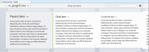
But this is where Gingko’s magic kicks in. It doesn’t just connect these cards in the manner of a spreadsheet or a table. Gingko in fact is a horizontal outliner. This means that e.g. when you attach a new card to an already existing card horizontally, together they are starting to form a branch within a hierarchical outline. The card on the left becomes a parent, and the card on the right becomes the child, and so on, ad infinitum.

Gingko app

A single branch of a simple horizontal outline in Gingko

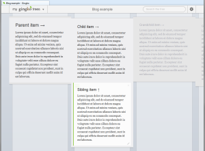
But it gets even better. If you now add another card below that child, within the same column, the new card becomes a sibling of the card above, and another child of the aforementioned parent.

Gingko app

Horizontal and vertical hierarchies in Gingko

Now you might wonder: how do multiple clusters of cards connected across both columns and rows can possibly fit in the same space, if they have a different number of cards all connected in different formations? After all, outlines don’t usually have the same number of children and siblings under each parent. This is where the second bit of magic happens. When you click on any of the cards, the card and its entire cluster of parents, grandparents, siblings, children and so on rotate into view through an ingenious mechanism that works a bit like a “fruit machine” (if you’re reading this in British English), or like a “slot machine” (if you’re reading this in North-American English). The same happens if you are navigating with the keyboard arrows. It’s an incredibly clever way to navigate such a complex arrangement.

Gingko

Clicking on “Parent 1 item” rotates its branch into view and centres it, highlighting all connected offsprings

You might still ask: but what is the advantage of writing in such an application? A horizontal outline after all is just like a vertical outline, except it is laid out horizontally… But Gingko is not only a horizontal outliner. As it utilises Markdown, you can add six levels of headings anywhere in the text, which means that you can also do ‘vertical’ outlining, by promoting and demoting the text within a card (or the card itself) without having to actually move the card anywhere. E.g. by adding a Level 1 heading to a card, and a Level 2 heading to its sibling connected from below, the second card now also becomes the child of the card above (while remaining a child of any card to which its “sibling-parent” is connected on the left).

Gingko app

Using Markdown headings to create a vertical hierarchy in Gingko

I put ‘vertical’ above in quotation marks, as—and this might sound a bit confusing initially—you can also apply this parallel or ‘vertical’ hierarchy horizontally, across the columns.

Horizontal and vertical outlining in Gingko

Markdown headings used to create a hierarchy both horizontally and vertically

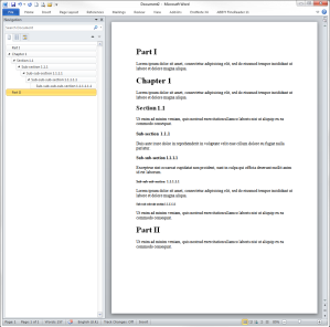
The Markdown headings are the same thing as headings in MS Word, and if you export a Gingko tree (as a Gingko document is called) as HTML and copy and paste it into Word, the headings will be automatically converted into Word headings. There is another bit of Gingko magic to exporting: horizontal and vertical hierarchies and the Markdown headings (as long as you’ve used them consistently) are all neatly arranged into a single, classical (yes, vertical) hierarchy of headings in the exported document.

Gingko Markdown export

Gingko tree exported as Markdown with horizontal hierarchy converted into a vertical hierarchy

Gingko HTML export

The same Gingko tree exported as HTML, with headings now formatted

Gingko imported into MS Word

The same Gingko HTML export pasted into MS Word, with headings correctly recognised

But I still have not mentioned the killer feature of Gingko. Although the cards are horizontally connected through the “slot machine” mechanism, you can also ‘deactivate’ this hierarchical connection by simply scrolling away to any note in the other columns, while carrying on writing in your centred index card in your focal column. It is immensely useful to be able to call up a note that otherwise might be connected to an entirely different and distant part of the hierarchy, and view it side-by-side with the index card you happen to be editing. If you were using a traditional vertical outliner, you would have to abandon the text you are writing to scroll up or down and drill deep into branches to look for your note, losing both your original place in the outline and your train of thought.

Gingko app

While the edited card remains centred in column 2, the cards on the left and the right are “scrolled up” to be displayed alongside it for reference

There is a lot more to say about Gingko, but I’ll keep that for another post. In the meantime, do check out Gingko’s blog and their Youtube video, as they offer many other user case scenarios.

Update (14-Oct-13):

In response to a reader’s query, here is how to emulate a footnote using the superscript tag with Markdown,

<sup>1</sup>

and the Level 6 heading with Markdown, which produces small font suitable for a footnote:

 ###### 1

The footnote area is separated from the body text by the horizontal line:

---

Here is a screenshot of the card in view mode:

Footnote in Gingko

Emulating a footnote with Markdown in Gingko

And here is the same card in edit mode (the English spellchecker in my Firefox went a bit crazy with the Latin text :):

Footnote in Gingko

The same card in edit mode, showing Markdown syntax