Kami or Squid for annotating PDFs with stylus on a Chromebook? Mini Review

Recently I got myself a Samsung Chromebook Pro (which comes with a Wacom EMR stylus), and I was looking for apps to annotate PDFs with a stylus. In the end Kami (formerly Notable PDF) and Squid (formerly Papyrus) emerged as top contenders. It’s not entirely a fair comparison, as one is a Chrome extension, the other an Android app, and I used two different PDF files to annotate, but here are my main observations.

Where Kami is better:

  • If you have the Kami Chrome extension enabled as your default PDF reader, you can start annotating as soon as you download a PDF file, as it opens automatically in Kami, with all the annotation tools ready. With Squid it’s a few more steps, as you need to save the PDF first somewhere where Squid can import from (local download folder, Google Drive, Box, or Dropbox), then launch Squid, hit the new note button, choose “Import PDF”, and then navigate to the PDF file to import it.
  • In Kami you can scroll through the entire PDF file during annotating. In Squid, you can only see one page at a time, and you can move forward or back by only one page at a time.
  • As long as you are online, Kami syncs every change instantly to Google Drive, so you have a backup copy, should anything happen to the local device, and can have multiple copies open and synced live on multiple devices (and possibly multiple users, if you’re sharing your PDF file with others). In Squid, there is no sync. Instead, there is a “Cloud backup” option, which only works with Box and Dropbox, and there is only an option to back up every 6 hours or manually. There is also an “Export PDFs” option, which can similarly be set to “every 6 hours” or be triggered manually. In my experience, the Squid backup was not very reliable. Sometimes it failed to upload the backups (blaming it on “network errors,” “I/O errors” and so on), sometimes it only uploaded some of the files, and Box for some mysterious reason failed to sync the files with its Windows client on my laptop. For Chromebook users there are obvious benefits with Kami being so seamlessly integrated into the Chrome browser and Google Drive, and not having to pay for Box or Dropbox. But the instant sync notification in Kami can be a bit distracting during reading and annotating.
  • In Kami you can choose not to use your fingers at all and use the stylus for scrolling and all other actions, if you don’t want to be touching the screen.
  • Kami maintains zoom level as you scroll through the document, while in Squid you need to reset the zoom level each time you navigate to the next page or back.
  • Using Kami to annotate PDFs leaves Squid free for taking additional handwritten notes, and it is easy to switch between Kami and Squid via the shelf. If you’re annotating a PDF in Squid, it is more awkward to switch to another Squid note, as you need to exit each in order to be able to navigate to the other.
  • Kami’s tools (which are in a vertical bar on the left of the screen) are a bit more easily accessible (especially for a left-handed person), and it’s easier to switch between e.g. the pen tool and the highlighter, than in Squid, where the tools are in the top right corner (which right-handed people might still find easier).
  • In Kami it’s possible to scroll the page with a single finger, while in Squid you need to use two, otherwise you end up erasing your annotations. Unfortunately, this can still happen if your two fingers are not entirely in sync, and you accidentally erase stuff in Squid while trying to scroll up or down the page.

Where Kami could improve:

  • While Kami does work offline, the “undo” button is obscured by the offline notification tooltip, so “undo” cannot be accessed in offline mode.
  • When switching between tools, the tooltip labels for the tools (e.g. “Drawing”) persist, intruding into the margin that could be used for annotations, so you need to scroll up or down to be able to annotate on that spot. I don’t see any value in these tooltips persisting (and any need for them at all).
  • Normally when you start annotating a newly opened PDF in Kami, there is a popup asking you if you want to save it to Google Drive for syncing. This is a nice feature when you’re online, but if you happen to get it when you’re offline, the popup persists and is impossible to close, obscuring a part of the PDF, which is pointless and annoying. Even when the internet connection was re-established, I could only get rid of it by refreshing the whole page and reloading the PDF. It looks like a bug.

Where Squid is better:

  • There is no distracting sync notification (but there is no sync either).
  • The exported PDF is properly flattened, meaning that when you open it in another PDF viewer on another operating system, the annotations are fixed, and you can freely copy and paste text from the PDF, without interfering with the annotations, or the annotations interfering with the copying. Kami’s exported PDF on the other hand does not properly flatten the annotations, meaning that they remain floating objects, so if you e.g. want to copy some text from the PDF, you can accidentally start dragging the annotations out of place. Personally I can put up with this (and just use the clean version of the PDF file for any copying), but it could be a problem if someone else might need to read your annotations, and they might unwittingly drag them out of place. Also, Squid’s PDF export was PDF/A-1b standard compliant. But I don’t know if that had something to do with the underlying PDF file and not Squid.
  • Squid (at least on my Samsung CBP) had pressure sensitivity, which meant that annotations could be done in thinner handwriting than in Kami. In general Squid allows for more granularity in stroke thickness etc.
  • While I used different files to annotate for this review, so this information is not directly comparable, it seemed that Squid’s annotations required less overhead in terms of increase to the file size. After annotation, the PDF in Squid increased from 376KB to 791KB in size, while in Kami it increased from 364KB to 6.31MB. For this to be a fair comparison I should have made the exact same annotations to two copies of the same file, but on the whole it suggests that Squid is more economical with its use of data.

Verdict

For now I will probably stick with Kami, as I like the live Google Drive sync, I like the fact that I can scroll through the entire document, and that I don’t risk deleting annotations if I use my finger to scroll up or down. I also like the option of being able to use Kami and Squid together, annotating in the former, and taking additional handwritten notes in the latter. These benefits for me outweigh the negative points about the floating annotations and the big increase in file size.

Update (27 May 2018):

I have also posted this review on the Chrome OS Reddit site, and there was a bit of a discussion.

Christian Tietze on the Zettelkasten way

Here is an interesting post by Christian Tietze that spells out the main software requirements for the implementation of a Zettelkasten type notes database. This is pretty much how I manage my reading notes these days in ConnectedText. I am really looking forward to reading the software reviews that Christian aims to undertake.

PCWorld’s review of ConnectedText 6

ConnectedText 6 review: Personal wiki adds long-requested features – by Ian Harac

Offline personal wiki tool ConnectedText is ideal for college students, researchers, writers, and anyone else who needs the ability to mix freeform text with keywords and structure, or to perform queries and aggregations based on arbitrary criteria. The new version 6 adds long-needed enhancements to content aggregation, display, and searching.

PCWorld review of ConnectedText 6

Gingko app reviewed in The Chronicle

Natalie Houston, associate professor of English at the University of Houston, discusses Gingko app on the ProfHacker blog at The Chronicle of Higher Education.

Write in a New Way with Gingko

I’ve been using Gingko for a couple of weeks and really like it. I find it’s especially valuable for collecting ideas and notes about a topic and then developing more structured pieces of writing from them. As a spatial thinker, I often write ideas or paragraph stubs on index cards or half-sheets of paper and move them around on a table; this tool lets me integrate the same kind of planning with my writing process. I already do a lot of my work in plain text format, so I appreciate the ease with which Gingko exports files and integrates in to my existing workflow. Finally, although I certainly could (and often did, before finding this app) simply create a lot of individual text files as virtual “cards” on my desktop, the clean visual display that Gingko offers really appeals to me. This is the first digital tool that offers mindmapping-like features in what is for me a truly intuitive design. I’m going to continue using Gingko for my own work and look forward to its continued development.

From WordExpander to PhraseExpander

In my tutorials on how I use ConnectedText for qualitative data analysis, I mentioned that—following a suggestion from a reader—I had adopted an application for text expansion during the coding process. If you haven’t used such a software before, the main point of them is to speed up typing, by being able to call up frequently used words from a saved list by just typing a shortcut. I am not a touch-typist, so not having to retype long words with complicated spelling is a godsend.

Being the busy PhD student that I am, I didn’t have either the patience or the time to spend a huge amount of time evaluating these software. I downloaded a few, tested them quickly, and if they looked too complicated or wrong for the job, I promptly uninstalled them. I narrowed down my requirements to one single, simple feature. After entering the first few letters of a frequently-used word, I wanted some kind of a pop-up list to show up right next to the cursor, from which I could quickly select the word with up and down arrows, hit Tab, and have the word automatically inserted.

text expansion example

The “EasyComplete” feature in WordExpander

It turned out that that particular feature was not very common. In fact, it seems to be considered a premium feature, mostly included in expensive professional editions, which sometimes are beyond a student’s budget. Naturally, I gravitated towards freely available options. First, I checked out PhraseExpress, which claims to offer its software for free to personal users, but with some kind of a tool to detect if one is a professional user. It seems that being a student puts you in this second category, as I started getting some nagging screens saying that I was a professional user. It just got too annoying, and I uninstalled it soon thereafter.

As I kept searching, I came across the free WordExpander, which did actually do what I wanted to accomplish, and it seemed fairly easy to use, even though it did not look as polished a product as some of the others I looked at. I used it almost on a daily basis for about nine months, and stopped using it about a month ago.

WordExpander

This is what WordExpander looks like

Why did I stop using it? The main reason was that it started interfering with my AutoHotkey scripts I’ve been using in conjunction with ConnectedText, my main tool. I’m not an AutoHotkey expert. I’m not able to debug my AHK scripts or even to determine whether they are the source of the problem. But when I switched WordExpander off, things returned to normal.

There were a number of other limitations in WordExpander that started to get to me. Firstly, it does not work in every application. It did happen to work with CT and some other text editors, but it wouldn’t work properly in browsers for instance. If you’re writing a forum post, for example, the popup word menu would show up in the top left corner of the screen, which was just too cumbersome for the eye to follow. As I use multiple monitors, sometimes the popup menu would show up on the wrong monitor, not the one I was typing in. I  avoided using it in Windows Live Mail altogether, as WordExpander made any kind of typing painfully slow, due to some strange interference.

detection active

The “Detection active” feature that would not deactivate…

Another problem with WordExpander was that some of its features just wouldn’t work. There is e.g. a “detection active” option when you right-click on the WordExpander icon in the Windows taskbar, to switch WE on or off. It has never worked, so I would have to completely quit the application, if I wanted it to stop the popup menu from showing up. A rather annoying shortcoming that cut into my workflow was its inability to keep the capitalisation of a word I had typed: it would just turn it into lowercase, so I had to backtrack every time to correct that.

Also, for some reason at system startup WordExpander would launch multiple copies of itself, with a row of WE icons sitting in the taskbar. I would have to quit WE and relaunch it again to get rid of the other occurrences.

12 instances of the WordExpander icon after booting up

12 instances of the WordExpander icon after booting up

As time went on and my phrase library grew, the application got increasingly slower. I got to 415 words in my main library (the other 4 libraries had about another 40 words), which I didn’t think was a terribly big database to handle. But when I installed WE on my Windows XP netbook with 2GB RAM, it was so slow it was simply unusable.

Maybe I shouldn’t complain too much, since the app was free and I did get some use out of it. But my point is that the benefits of the free version do come to an end at some point (and I don’t even consider myself such a heavy user, given my small phrase library). Plus one needs to be prepared to put up with the above problems.

So, I was left without a text expander, just when I was about to get back to my writing after the summer holidays. I probably would have had to start looking for an alternative fairly soon, but as luck would have it, just a few days ago I was offered a review copy of PhraseExpander, which is another major player in this arena that formerly escaped my attention.

PhraseExpander

This is what PhraseExpander looks like

As many software in this category are very similarly named (TextExpander, WordExpander, PhraseExpander, PhraseExpress etc.), it’s quite easy to overlook one of them or confuse them with each other. In fact, WordExpander is marketed as the “free PhraseExpander” on its website and Facebook page—as it turns out, by the maker of PhraseExpress—which almost sounds like a compliment from a rival (imitation is the sincerest form of flattery, as they say), but it also exemplifies the extent to which competitors are prepared to go to confuse the unsuspecting online shopper.

For all the above reasons I was very curious to see what the “real” PhraseExpander looks like and how it compares with the “free” version offered by its competitor. I will be testing PhraseExpander Professional over a three-month period (which happens to coincide with the writing of my thesis), and I will post my reflections on my experience here. I have only been using it for two days, so it’s a bit early for me to say too much about it just now. I will write a short post soon with my first impressions. But let me just say for now that none of the problems I’ve mentioned in relation to WordExpander are occurring, which is a relief. It’s fast, it works in all applications I’d tried so far (in browsers the popup window would be in the upper middle part of the screen, at eye level, which is an improvement on WordExpander’s top left positioning), detection “on and off” works, capitalisation works, and most importantly, it does not interfere with my AutoHotkey + CT setup.

The "SmartComplete" feature in PhraseExpander

The “SmartComplete” feature in PhraseExpander

The contrast in user experience is pretty obvious from the moment “go,” but then perhaps one should expect that from the professional version of an application that competes in the premium segment of its market.

Kindle is not for me

Surely I must count as some sort of a dinosaur, as it was only today that I’d purchased – and then promptly returned – my very first Kindle e-book. I managed to avoid Kindle up until now by being able to find paper books or online e-books at my university library for the titles I needed. But today I urgently needed a book that wasn’t available at my library and I couldn’t find it in any other electronic format.

I did see the book before in some kind of a PDF format for a reasonable price at Google Play, and I naively assumed that it would be waiting for me there in my moment of need. It turns out that e-books can sell out too (how exactly, I don’t quite understand), as the PDF was gone from Google Play and is nowhere to be found on the net.

The Kindle version of the book I was looking for was slightly cheaper than the paperback, and if I bought it I could have it instantly, so I took the plunge and purchased it. I downloaded a copy to my “Kindle for PC” app, and another copy to the Kindle app on my iPad. But as soon as I started reading, I began to run into several disappointing surprises.

First, there was no real pagination for this academic e-book, which meant that I wouldn’t be able to reference quotes directly. I was amazed that after all these years of kicking around, the Kindle people still haven’t solved this problem.

I also found it inconvenient that when I carried out any sort of operation with the e-book such as a simple search, Kindle would re-flow the text and it would end up looking different every time. The highlighted text with my note that I expected to find at the top of the page ended up at the bottom of the page and so on. Annoying. I need to have a sense of where stuff is in the book that I’ve already read and made a note of. Shifting its position around just makes it more difficult to comprehend an already challenging academic text.

Then I discovered that there was no direct and easy way to export my highlights and annotations from either the PC or the iOS app. The only way I could get any quotes or notes out was if I enabled an external clipboard capture software and copied each quote and note individually. I was ready to put up with that until after an hour of copying and pasting Kindle had kindly informed me that I had reached the copying limit set by the publisher. What? I’ve paid for this book, I should be able to copy out anything I like from it for my personal use, just like I can do with a paper book. I was starting to get angry.

The “icing on the cake” was when I had enough of reading on  the PC and I decided to carry on in my armchair using the iPad. When I loaded the Kindle iOS app, I fully expected to see my highlights and annotations that I had created on the PC app and which had been synced with the Amazon cloud. But after several attempts at reloading and refreshing, my notes simply didn’t show up on my iPad.

Perhaps some of the above problems had to do with me being a Kindle novice and missing some of the features that may have solved them instantly. But I just had an overwhelming feeling of being underserved and constrained by both Kindle apps and the entire platform. Both apps are very feature-poor compared to such excellent PDF readers like GoodReader or PDF Expert. I could think of two possible reasons for this. 1) Amazon can’t be bothered about the academic market that needs page numbers and annotation sync and export, or 2) it is some sort of an underhanded effort to force you to buy an actual Kindle device, where I presume at least some of the above issues have already been resolved.

Whatever the case, I’ve returned my first Kindle e-book and I will avoid buying another one, if I can help it. And I certainly won’t be buying a Kindle device any time soon. I’d rather read a good old PDF file on my iPad any day!

P.S. (12-Apr-2013):

Another shortcoming of the desktop PC Kindle app is its inadequate search function. I did a search for a single word in my e-book, and Kindle returned the suspiciously round figure of 100 results. I went through all the 100 results and then repeated the search. Not only did I get a different figure the second time (99 results), but they included results not contained in the previous search. When I manually flipped through the rest of the book, I found several occurrences of the search term that were simply not found by the Kindle app in either of the first two searches.

Together with everything else I mentioned, this makes the Kindle PC app – in conjunction with the iOS app – unsuitable for academic reading (at least in comparison with the tools available in PDF readers such the aforementioned iOS apps and PDF-XChange Viewer on the PC).

P.P.S. (12-Apr-2013):

Out of curiosity, today I had installed the PC app for NOOK Study and downloaded the same e-book (in whatever format NOOK uses) that I tested with the Kindle app. NOOK Study is directly targeting the academic audience, so I expected it to be more sophisticated. And it was, to some minor extent. For one, it allows you to export your annotations in .doc and .txt format, which would work for me. But I still found it far inferior to the PDF readers I use. I wasn’t able to test the search function because, as NOOK informed me, they were still building the search index for this book, and the search function would be available at some point in the future, depending on the size of my library. It all sounded a bit too tentative to me.

However, the problem of the page numbers has not been resolved. NOOK did provide the page numbers, but they were not the same as those of the paperback, which they claimed to have used for the e-book version. Basically they had started numbering the pages from the electronic table of contents that they had inserted in front of the cover of the scanned book, and then they kept on counting all the pages for which there weren’t even page numbers in the paperback. For this reason all the page numbers had shifted. This wouldn’t be a problem if the text of the book had not been reflowed, as I could have just recalculated the pages myself. But unfortunately NOOK re-flows the pages, meaning that the pages become meaningless and useless for the purposes of academic referencing. Too bad. PDFs it will be…

Mindsystems Amode V3 under development

I was glad to find out yesterday that Mindsystems has decided to develop a new version of Amode. I’ve written about Amode V2 before, explaining why I like it as a project management solution. I can only hope that Mindsystems will preserve their unique tree + Gantt + calendar integration, which is the main reason why it’s my preferred project management tool. Mindsystems are offering a discount to existing and academic users, and the price should be even lower if you buy it from outside of Australia, as you shouldn’t have to pay the tax.

Update (24/01/2013)

Mindsystems have been kind enough to contact me today “To confirm the multi-view will be a strong feature of the new design.” That is really good news. I have tried several project management software but Amode is the only one I’ve seen where you can choose to construct your project in a hierarchical tree, a Gantt chart, or a calendar, and it only takes one click to switch between them.

Update (27/06/2013)

Got word a few days ago from Mindsystems that development of Amode has been suspended due to lack of sufficient market interest. Too bad.

Outline 4D for drafting and reverse outlining

In my previous post I mentioned that Outline 4D (formerly known as StoryView) has become an integral part of my academic writing workflow, as my tool of choice for writing the first draft. O4D may sound like a surprising choice for this, and its emergence as such was unexpected for me as well.

O4D is primarily known as a scriptwriting tool or an outliner targeting creative writers. It is quite old and it no longer seems to be developed. Originally I thought I would be using ConnectedText, Scrivener for Windows, MS Word 2010 or LibreOffice for writing up my PhD thesis. But through a trial and error process Outline 4D has emerged as the winner.

The main reason for this surprising development has to do with the fact that Outline 4D is a single-pane outliner with inline notes capability and with a wide range of visualisation options, which make it particularly suitable for both writing (as in developing sentences and paragraphs) and for reverse outlining (structuring the developing draft into a logical hierarchical structure). There are surprisingly few single-pane outliners with inline notes. I’ve tried them all and O4D is the most versatile in terms of visualisation and the speediest in terms of writing and reverse outlining operations.

Why not use a dual-pane outliner and writing tool such as Scrivener or a word processor such as MS Word or LibreOffice with navigation pane enabled? The main reason is that in a dual-pane tool you can’t just collapse and expand an arbitrary selection of sections and hierarchical levels to make only a particular part of the outline structure visible and still be able to work on a section of your choice for which that particular view is relevant.

Also, it’s just more helpful to be able to view the “headings” (“titles” in O4D) within the same pane, rather than have to look for them in a second pane. I will provide a screenshot below to illustrate how this is done in Outline 4D. Before I get to that one though, let me just walk you through the main options for visualising your developing draft in O4D.

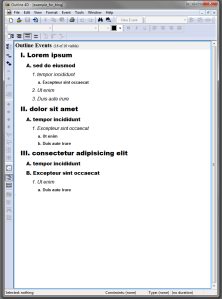
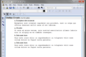
First, let’s take a look at the plainest view. You have a classical single-pane outliner with inline notes here. O4D allows you to customise the font and the background of each hierarchical level of the text. Each outline item or text snippet (called “event” in O4D, reflecting its scriptwriting origins) consists of a title and the inline note (called “content”). Both are optional, i.e. you don’t need to have a title if you don’t need one, and you don’t need to add content to the title if you don’t want to.

Outline 4D - plain view
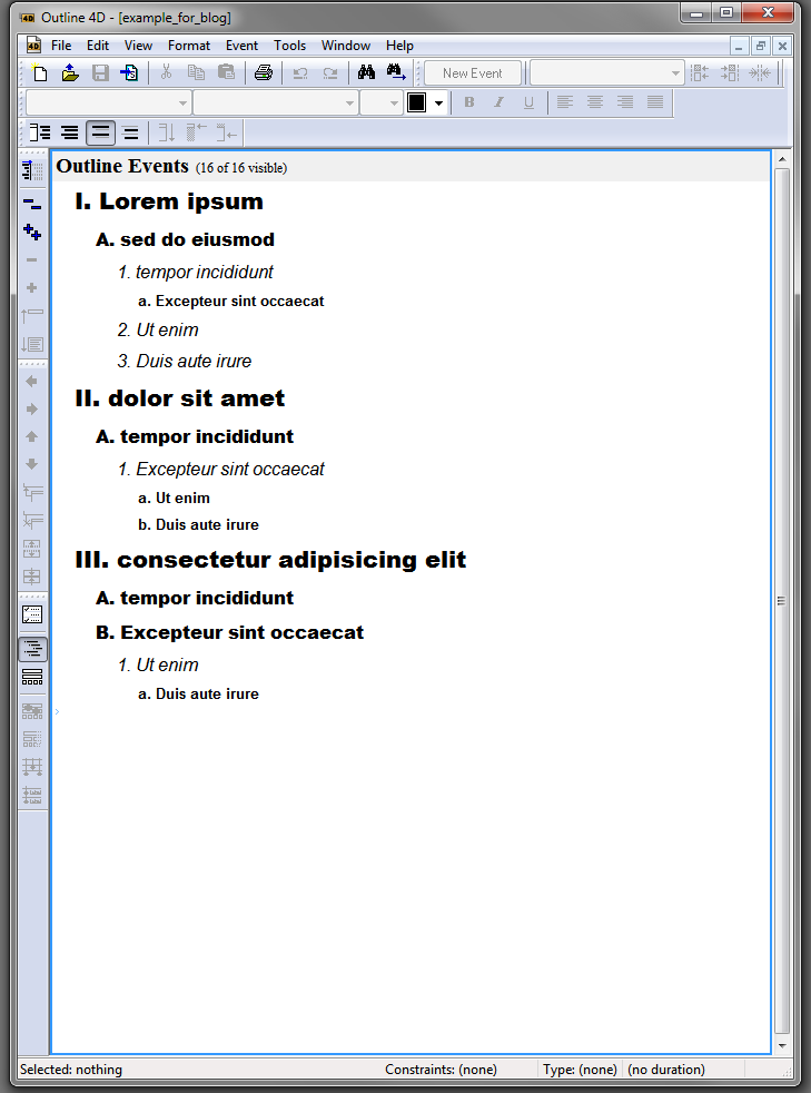
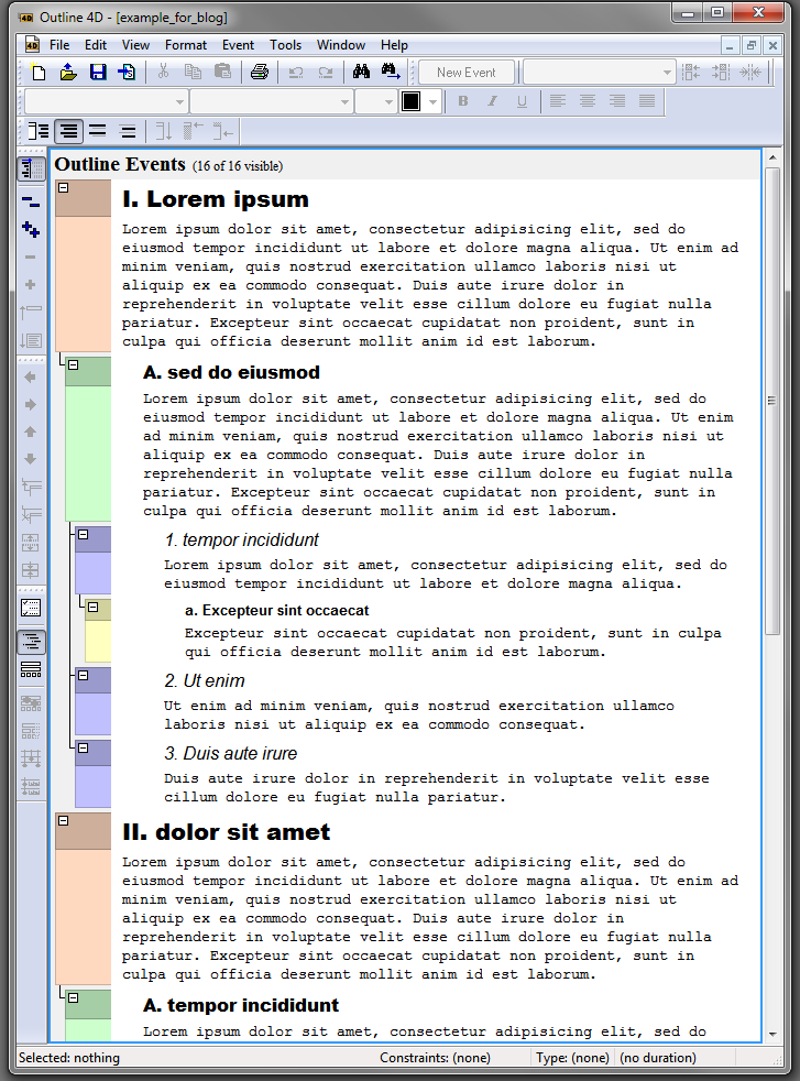
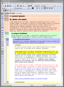
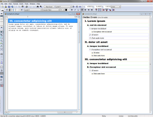
This text can be viewed (in  the main “Outline View,” as opposed to the “Timeline View,” which I’m not going to discuss here) in four different ways, which I find extremely helpful. The first one can be seen in the screenshot above, which shows both “Titles and Content (Ctrl+Shift+8).” This is the most complete view, i.e. all the textual content is visible.

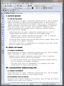
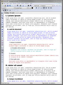
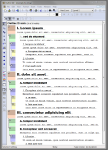
However, if you’d like to view the underlying logical structure only (as marked up by the various headings and sub-headings), you can click on “Titles Only (Ctrl+Shift+9),” and you get the following skeletal view, which hides all the inline notes (content):

Outline 4D: titles only

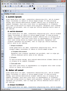
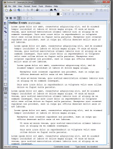
I like to add a heading or sub-heading to every single paragraph that I write, so that the above two views provide me with an overview of my entire logical argument and content. With a large document (10,000 words is a typical length for a PhD thesis chapter), this may at one point become overwhelming and you may just want to view the text itself, without all the headings and sub-headings. This can be easily achieved by hitting the “Content Only (Ctrl+Shift+0)” button. All you see here is the content of your paragraphs:

Outline 4D: content onlyIf this was not enough flexibility for viewing your content in different ways, there is still the “Custom Visibility (Ctrl+Shift+7)” option. It allows you to individually customise every single item (title + content, which for me equals a paragraph and its topic) in your document, so you can hide for example meta commentary that is not strictly part of your text.

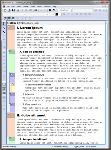
The beauty of O4D is that these views are not just there for visualising the text differently on your screen but you can also print or export your text as an RTF file in the selected view. Even the word count tool allows you to exclude event titles or only include selected “events” (outline items). Here is an example of a custom view. I hid the contents for level 1 titles and I hid the titles for level 3 and 4 content.

Outline 4D: custom visibility
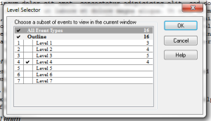
And there is more. There is also something called the Level Selector, which allows you to select text residing at a particular hierarchical level in the outline to be displayed on its own. Here I deselected all levels except Level 4:

Outline 4D: Level SelectorAnd this is what “Level 4 text only” looks like:

Outline 4D: Level 4 onlyI haven’t used this feature yet for my current project but I could see it becoming useful once large texts become available and let’s say I’d only like to see the Level 1 text, which would be all the introductions to various sections, thus giving a quick overview of the overall project, allowing me to check for logical consistency, ease of comprehension and transition between sections.

Until now I have kept colour out of this discussion, as I didn’t want it to be a distraction while discussing the above features. But when it comes to outlining, I’ve always found the ability to colour in an outline on the basis of hierarchical level very useful, as it just makes the navigation of the outline and comprehension of its logical structure so much easier. (This is one reason why I love Natara Bonsai so much. Sadly Bonsai doesn’t have inline notes.)

When it comes to adding colour, one is spoilt for choice in Outline 4D. First, O4D allows you to customise your font colour on the basis of the hierarchical level, so you can have different colours for both the title and the content for each level. This works automatically, every time you add a new section. Here is an example with different font colours for item contents:

Outline 4D: text colour by levelPersonally I don’t use this feature in O4D, as I find it too busy for viewing inline notes (although I use it a lot in Bonsai for a regular outline without inline notes). Instead, I prefer to colour in the background of the outline items. There are several options for that. Similarly to the font colour, you can customise background colour per hierarchical level (but there are other options as well).

A discreet and quick way to turn on a partial background view is by clicking on the “Toggle Structure Column” button, which brings up the Structure Column that shows the hierarchical relationships between the outline items and shows a bit of their background colour:

Outline 4D: structure columnIt is also possible to colour in the entire background of the outline items (these obviously change automatically when you indent or outdent an item):

Outline 4D: coloured backgroundIt depends on the stage of the writing and the particular writing or editing task whether I opt for a distraction-free all-white background or I turn on a partial or full background-coloured view.

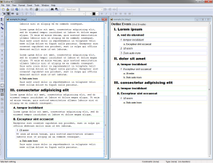
Here is a screenshot I promised at the beginning of this post to illustrate why I find O4D better for reverse outlining than dual-pane outline setups like Scrivener, WhizFolders or MS Word 2010 with navigation pane. Here I collapsed Part I and Part III completely, so I can focus on Part II. Even within Part II, I can selectively collapse or expand particular sections, depending on whether I need to see them during the writing process.

Outline 4D: collapsed events
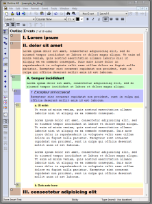
Here I’m working on the section entitled “Ut enim.” You can see that the body of the active section has a white background, which makes it easier to see where you are and also to indicate that work is being done here. I have written three paragraphs already, so the next step would be to do the “reverse outlining,” which would involve splitting off these paragraphs into their independent sections, giving them a title that summarises them, and indenting or outdenting them according to how they fit into the overall train of thought logically.

Finally, it is also possible to mark up the inline text with a limited selection of rich text formatting. There is yellow highlighting only, bold, italics, underlining, and you can also change the font colour further. It is possible to designate URLs and email addresses as such, but they would only become functional after the text has been exported as RTF.

Outline 4D: rich text formattingI don’t tend to bother much with formatting my text because here I want to concentrate on writing, not on word processing. Outline 4D is not compatible with citation software either but that doesn’t bother me, as I find using EndNote referencing during writing distracting anyway. Instead, I just type my references manually such as (Smith 2010: 345), and then I replace them with EndNote references once I’ve exported the completed draft into Word.

Another useful characteristic of O4D is its multiple document interface (MDI). This means that you can open and display multiple O4D documents within a single window. This becomes useful when you want to compare multiple documents (e.g. different versions of a draft) and edit them simultaneously. Here is a view of eight O4D documents tiled vertically across two monitors:

Outline 4D: eight windows tiled

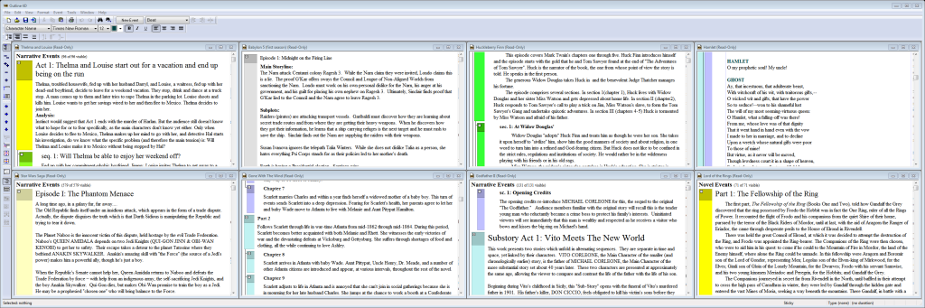
The downside of MDI is that you can only run one instance of O4D, which makes it a bit awkward (but not impossible) to view a set of O4D documents in one monitor and write another O4D document in another monitor. I get around this restriction by doing the writing in StoryView, which is an earlier (and 99% identical) version of O4D. If you decide to buy O4D, it’s worth asking the developer or the retailer whether they can also give you a licence for StoryView.

I hope I have managed to demonstrate why I think Outline 4D is an excellent writing environment for drafting and reverse outlining. As I mentioned it in my previous post, this stage for me comes after the note-taking and outlining stage, for which I prefer to use ConnectedText and Freeplane.

The next step would be to export the Outline 4D document as an RTF file, convert it into a .docx file in Word, add my EndNote references, convert the O4D headings into Word headings in order to produce a table of contents, and add any further rich text formatting necessary (which would mostly consist of adding italics for emphasis). Then it’s off to the printer.

If you decide to give Outline 4D a try on a Windows 7 machine, make sure to run it in Windows XP mode and as an administrator (right-click on icon, choose “Properties” and click on “Compatibility” tab). Even then I needed to disable “User Account Control” (UAC), to stop the annoying Windows pop-up.

I did come across one bug: it crashes sometimes if you change some options in the “Outline 4D Options” window while in “Timeline View.” So make sure to save your work before changing those options. Having said that, I haven’t lost any work in O4D so far. But I do save my work often (there is even an automatic reminder you can set to save after a given period) and export it into RTF daily, just to be on the safe side. It’s an old piece of software after all.

It’s an oldie, but a goodie!

——

Addendum (14/01/2013)

I’ve just realised that there is yet another relevant view of the outline that I forgot to add. If you select all items and click the “Summarize (Ctrl+[)” button, Outline 4D provides you with a summary view of your outline, consisting of all the titles and the first line of each content section. There is also an “Unsummarize (Ctrl+])” button to revert to the full outline. This summary view is an interim step between the “Titles Only (Ctrl+Shift+9)” view and the “Titles and Content (Ctrl+Shift+8)” view. It can be useful for skimming your document and getting an overview of the general flow and coherence of the text.

Outline 4D: SummarizeOf course there is still the “Timeline View,” but that is such a complex feature that it would take several blog posts to do justice to it. It’s like having yet another completely different piece of software, although it is intrinsically linked to the “Outline View” in some very ingenious ways. Hats off to the original developers, wherever they may be!

Addendum 2 (17/01/2013)

There is yet one more colouring-in option for Outline 4D. You can also choose “Draw Event Frames,” which is more subtle than “Draw colored event backgrounds,” as it only draws the borders of the “events” in the background colour that was selected for each hierarchical level:

Outline 4D: draw event framesP.S. Although above I linked to the developers’ (Write Brothers) website, where you can download a 5-day trial version, if you are interested in purchasing this software, it is worth shopping around. E.g. currently the download version is $89.95 at Screenplay.com, while at the Writers Store it is $79.00. But occasionally you can get it even cheaper from Amazon (the boxed version) or from small retailers outside the US, or if you catch a promotion at Screenplay.com (it was $65.00 back in November 2012).

Addendum 3 (30/01/2013)

I have discovered yet another cool feature in Outline 4D (not sure what took me so long). If you find that your outline is getting too big and you’re finding it difficult to get a sense of the overall document, or if you need to look at two (or three or more) different sections of the outline that are far away from each other and can’t be viewed simultaneously, you can always open two or more versions of the same outline and tile them vertically. This way you can get two (or more) live views of the exact same document, meaning that changes are updated to all open windows. This is how you do it: go to Window > New Outline Window and then choose “Tile Vertically.” Here is an example:

Outline 4D dual viewAddendum 4 (31/01/2013)

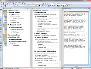
Although I said I wouldn’t mention Outline 4D’s Timeline View in this review, the previous visualisation gave me the idea that if you do the same trick with the Timeline View (i.e. go to Window > New Timeline Window > Tile Vertically), and then choose “View > Fit to view” for the index card version of the outline item you want to edit, you can emulate – and to some extent even improve upon – BrainStorm‘s famous “aerial view” or the much missed “document view” of GrandView. In the following screenshot you can see an example where an outline item is being edited as a standalone piece of text in the left window, while you can have any of the aforementioned 11 visualisations in the right (Outline view) window:

Outline 4D timeline with outline

P.S. In fact this feature can turn O4D from a single-pane outliner into a dual- or even multi-pane outliner. You could have a top-level outline open in the left pane, a more detailed outline in the next pane to the right, and then the single-note (document) view in a third pane (which would make it into a three-pane outliner).

P.P.S. Here is a screenshot of Outline 4D as a three-pane outliner. The left pane is “Titles only” view; the middle pane is “Summary” view with first line of content showing, and the right pane is in “Timeline view” with “Fit to view (Ctrl+3)” on, only showing one item in focus.

Outline 4D three pane outliner

Taking stock: favourite software tools of 2012

Legend:

  • Software I started using in 2012 in bold.
  • Software I’ve been using for many years (old faithfuls) in italics.

Used daily:

  • ConnectedText
  • Natara Bonsai
  • Outline 4D
  • NoteTab
  • VUE
  • Freeplane
  • EndNote
  • Directory Opus
  • WordExpander
  • Direct Folders
  • PureText
  • ClipCache Pro
  • WinSplit Revolution
  • MLO
  • SE-TrayMenu
  • AppleWirelessKeyboard (script)
  • PDF-XChange Viewer
  • Mindsystems Amode V2
  • ClicKey
  • Fences
  • Protopage
  • iDoneThis
  • MozyHome
  • Waterfox
  • Classic Shell

Used frequently (at least weekly):

  • Nebulous Notes (iPad/iPod)
  • Surfulater
  • Linkman
  • Dragon NaturallySpeaking
  • PDF Expert (iPad/iPod)
  • GoodReader (iPad/iPod)
  • Passwords Plus (iPad/iPod/PC)
  • Dropbox

Used occasionally but indispensable for specialist tasks:

  • ABBYY Screenshot Reader
  • JPEGView
  • Greenshot
  • ABBYY FineReader 11 Pro
  • TreeSheets
  • Scrivener for Windows
  • Search Everything
  • Allway Sync
  • TeamViewer
  • Copernic Desktop Search
  • CarbonFin Outliner (iPad/iPod/PC)
  • A-PDF Comment Collector
  • Notability (iPad)
  • SmartDraw

Would like to use more:

  • BrainStorm
  • RecentX
  • Story Turbo
  • AutoHotKey

Haven’t used much (but still on my favourite list):

  • iThoughts (iPad)
  • Noteliner
  • WhizFolders Organizer Deluxe